Making Posters
From time to time, you may need to create a poster to present your research. If you have received a Cheriton Scholarship, you must present your work at the annual Cheriton Symposium (typically once every two years you hold the award). You might also choose to present posters at academic conferences or industry events. In all of these cases, you will need to design, print, transport, and present your poster.Table of contents:
Designing a Poster
Unlike presentations and papers, there is no consensus and much less collective knowledge about what makes a good poster. The general advice is that a poster should be mostly or entirely "stand-alone"; most or all of your meaning should be conveyed to a reader even without your verbal explanation. There is a smaller school of thought that suggests that posters should simply act as visual aids for your verbal presentation, which is the primary source of content. There is even less agreement about the visual contents of a poster. There is general agreement that posters should not be saturated with text (the most egregious violation of this advice is using a printout of an extended abstract as the "poster"), but the optimal ratio of text to diagrams and other visual flourishes is contested and heavily depends on the expectations of the venue. A highly artistic and captivating design might help to attract spectators at a large multi-disciplinary conference, while an extremely technical treatise filled with equations might help to spark lengthy conversations and form valuable connections at a small and highly focused academic workshop where experts carefully inspect every poster. If you know someone that has been to the presentation venue before, ask them about what is expected. In the end, you will need to use your own judgment to decide on an appropriate design.Design Invariants
No matter how you design your poster, there are a few things that you should always do:- Make sure that you know the maximum poster dimensions for the venue. Try to target the maximum size unless there are budgetary constraints or logistical constraints with transportation. The maximum poster size for the Cheriton Symposium is normally 46"x34".
- At the top of the poster, include a title and an author list (including names and, optionally, affiliations and/or contact information).
- Make your name in the author list visually distinctive (e.g., a different colour or font style) so that visitors know who you are.
- If your poster is associated with a paper, include a way to find the paper. This can be a standard textual reference (i.e., title, author list, venue, page numbers, and year) and/or a QR code with a webpage or PDF link.
The Standard Design Process
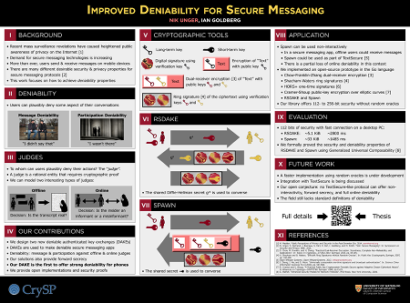
An example of the "columns of boxes" poster design.
Distinctive Designs
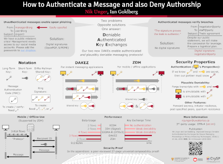
An example of a more distinctive poster design with similar subject matter.
- Your title is about 90% of your poster
 . The vast majority of people will decide whether or not to approach your poster based on the headline alone.
- Do not put an abstract on your poster.
- Avoid logos if you can. If you must have them, relegate them to the bottom of your poster.
- The top left of your poster is the most valuable "real estate". The bottom is the least valuable.
- Add accessible "entry points" to your design: large photos, headlines, "pull quotes", circles, and white space are useful tools.
- Avoid boxes. Use white space instead of boxes to divide your content. Do not put boxes inside boxes unless you have a very good reason.
- Avoid large blocks of text.
- Seek feedback on your poster, especially if it is your first design.
- Never use Comic Sans.
- Use only one method to emphasize content, and use it sparingly.
- Avoid tables if you can. If you feel like a table is necessary, use a minimal number of horizontal lines, and avoid vertical lines entirely. Use white space and alignment to achieve the table layout.
- Minimize references.
- Use large fonts that are readable from a distance.
Colours, Fonts, Logos, and Shapes
There are no design rules for posters. You do not have to adhere to any particular style. There is no CrySP-specific style. However, if you are looking for a coordinated colour scheme and style but you are not interested in creating your own, then you should consider using the University of Waterloo's visual brandingTools
In contrast to choosing the graphical philosophy and content, the logistics of designing a good poster are well-understood. The first step is to choose the software that you will use to design your poster, keeping in mind the type of design that you would like to create. There are a few main tools that CrySP students have used in the past, each with its own set of problems:- LaTeX. There are numerous poster templates available for LaTeX. In the past, students have successfully used ShareLaTeX templates like Poster Template II. The main advantage of LaTeX is that it is extremely easy to include complicated mathematical equations in your poster. The result is also a vectorized drawing, so you can exploit the full capabilities of the printer. Additionally, it is comparatively easy to start using this tool because most students are already familiar with LaTeX. One downside of this approach is that it can be difficult to make slight design adjustments because you are not directly manipulating the output; compilation adds a layer of abstraction between your content and what is printed. This is a more significant problem for highly artistic designs that eschew the typical "columns of boxes" layout. It is very difficult to create layouts that require arbitrarily placed components and overlapping layers.
- InkScape. This is a vectorized drawing program that is often used to create diagrams for papers. Like LaTeX, InkScape will produce output that uses the full resolution of the printer. Since there is no intermediate compilation step, this is a WYSIWYG tool that allows you to directly manipulate the final design. This makes InkScape very useful for more visually complicated designs. However, because it is a tool for vector images, all components of the image are represented as paths and symbols. This makes it difficult to achieve effects beyond what you typically find in diagrams: simple shapes with hard edges. Creating complex shapes is also difficult, because they must be expressed in terms of curving paths. Additionally, InkScape cannot create mathematical equations (though see the note on hybrid approaches below). Some students have also reported that InkScape is not very user friendly, so it may not be a good choice if you are unfamiliar with the program.
- GIMP / Photoshop. These tools are extremely powerful and general-purpose rasterized image editors (i.e., they manipulate pixels directly). Generally, these tools have strengths and weaknesses that are opposite to InkScape and other vectorized tools: they can easily create complex anti-aliased objects, render arbitrary patterns, and apply sophisticated post-processing to photos, but the tools are not very good at managing simplistic shapes like those found in diagrams and flow-charts. Moreover, since the output of these tools are images (e.g., PNG files), there is a fundamental limit imposed on the resolution of the printer. For this reason, always work with images that are configured to use 300 DPI/PPI (dots / pixels per inch) or higher. There is little advantage to exceeding 600 DPI. Ideally, you should create your entire poster on a canvas with the final resolution. Never scale up an image (or images that you paste inside your poster document). If you absolutely must scale down the image, try to limit yourself to negative powers of two (e.g., 50% or 25%) to avoid aliasing effects. Like InkScape, these tools cannot easily create mathematical equations, and they have comparatively difficult learning curves. The main advantage you receive in exchange for these concessions is that it is extremely easy to manipulate individual pixels of your poster; these tools will facilitate the creation of unique and highly artistic designs.
- PowerPoint / LibreOffice Impress / Google Slides. Some students choose to create posters using software that is traditionally meant for creating presentations. These presentation editors are essentially simplified vector editors, so they share many advantages and disadvantages with InkScape and similar tools. The standard approach is to create a single "slide" presentation, and to design the poster within this slide. Since these tools are not designed for this purpose, they are mostly inferior to InkScape, and you will need to do unusual things like configuring the presentation resolution to match the desired printing resolution. PowerPoint includes a nice equation editor. Impress includes an equation editor that is slightly more limited. The main reason to choose these tools is if you need to design a poster quickly and you are unfamiliar with the other software.
Hybrid Approaches
You are not limited to using one program to create your poster. It is often useful to edit different parts of your poster using different tools. Here are some common techniques:- InkScape → LaTeX: When making your poster (or paper) in LaTeX, it is often easier to create a diagram in InkScape rather than using LaTeX packages like TikZ. While working on the diagram, save the file in InkScape SVG format (InkScape's native file format). Once you are ready to import it into LaTeX, crop the page (deselect everything, "File > Document Properties > Page tab > Custom size > Resize page to content... > Resize page to drawing or selection"), and save the file as a PDF. When compiling your LaTeX code with pdflatex, you can then simply use
\includegraphicsto import the diagram. - LaTeX → InkScape: There are two main scenarios in which this technique is useful. If you are primarily designing your poster in InkScape but you need some mathematical equations, you can create them in LaTeX and import them (as uneditable shapes) into InkScape. Alternatively, you might use LaTeX to design the whole poster, and import the result into InkScape to make a few manual tweaks that are difficult to achieve in LaTeX. In the latter case, you should be absolutely certain that your LaTeX design is final, because re-exporting the poster will necessitate re-applying all of your manual changes. In either case, compile your LaTeX file into a PDF. You can then open or import this PDF directly into InkScape. When you do so, make sure that you select "Poppler/Cairo import" in the import settings, or else InkScape will likely mangle your fonts.
- LaTeX / InkScape / PowerPoint → GIMP: This technique is useful when you would like to design most of your poster in GIMP, but you would like to make mathematical equations in LaTeX and diagrams in InkScape. In either case, export the components in PDF format and import the PDF directly into GIMP. The PDF will be rasterized during this process; ensure that you set the resolution in the import dialog (in "pixels/in") to match the resolution of your poster image. Of course, you cannot easily edit any of the shapes once they have been rasterized.
- GIMP → LaTeX / InkScape / PowerPoint: Sometimes it is useful to use GIMP to achieve a complicated effect (e.g., post-processing a photo) for a component of your poster. If your image uses multiple layers, keep the file saved in XCF format (GIMP's native file format). Once you have finished editing the image, export it as a PNG to avoid compression effects. Make sure that the image has an appropriate PPI / DPI. You can then import this PNG into your primary poster editing tool. Make sure that the image is correctly sized in the poster (in terms of inches) so that the PPI / DPI matches. Don't use this approach to design your poster in GIMP and apply finishing touches in a vectorized editor; doing so increases the chances of resolution-related mistakes.
Tool-Specific Advice
This section includes specific advice for each tool, based on past experience from students:- LaTeX:
- Do not worry about aligning the position of boxes across columns until you are certain that your poster is otherwise complete. The maneuvering required to visually align the content should be the last change you make to the code.
- In templates that use the
colorpackage and the\definecolormacro, keep in mind that "rgb" is different from "RGB": the former specifies colour intensities as floats between 0 and 1, whereas the latter specifies them as integers between 0 and 255, which is the form used by colour choosers in most editors.
- GIMP / Photoshop:
- You will want to export your final image in PDF format. You can do this directly using "File > Export As..." in GIMP, or you can convert the final PNG to PDF format with ImageMagick using
convert -density 300 -units PixelsPerInch -quality 100 poster.png poster.pdfwhere 300 indicates the DPI. Note that using ImageMagick with large poster images may require removing resource limits set in/etc/ImageMagick-*/policy.xml. - You will need a relatively powerful computer with a lot of RAM if you intend to design a poster in GIMP. For a 42"x54" (15.75 square foot) poster at 600 DPI (25200x32400 or 800 megapixels), GIMP can easily reach 40 GB of RAM use with the default settings. To minimize the resource requirements, consider making your poster at 300 DPI. Whenever possible, use the "Layer > Autocrop layer" option to minimize the RAM impact of individual layers. You can also change RAM allocation in the Edit > Preferences > System Resources window. The "tile cache" is the main cause of RAM use and can be lowered significantly without many ill-effects. Note that GIMP will use more RAM than the sum of the values entered in the window.
- You will want to export your final image in PDF format. You can do this directly using "File > Export As..." in GIMP, or you can convert the final PNG to PDF format with ImageMagick using
Printing Your Poster
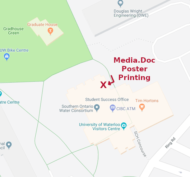
The entrance to Media.Doc is on the outside of South Campus Hall (SHC) on the North side.
Examples
Most past posters created by CrySP students can be found in the "poster graveyard" in the lab, or on various display boards in the area. This wiki also contains some poster examplesTopic revision: r15 - 2019-10-05 - NikolasUnger
|
|
Ideas, requests, problems regarding TWiki? Send feedback