 (Source: w3schools)
In this last section on CSS properties, we will highlight some of the basic properties that are the most accessible and useful.
The website w3schools is a valuable resource for finding out more about each property and exploring all of the CSS properties that are available (there are hundreds).
The first property we introduced was a font property (font-size).
The basic font properties are:
font-familyfont-sizefont-stylefont-weightSpecifying the family (the name of the font, such as Helvetica) is a bit tricky because fonts are often dependent on the device the page is being displayed on. The fonts that are available on Apple, Windows and Android devices are all very similar, but have some differences. Working with fonts can be especially tricky because of legal issues (e.g., they can be copyrighted in some countries). Fortunately, the use of fonts is becoming more reliable as the Internet has matured. Projects such as Google Fonts are providing free fonts defined on the internet that can be used in your website.
For now, to tackle this problem it is best to specify "fallback" fonts that can be used in case the font specified is not available on the device.
font-family: "Times New Roman", Times, serif;
The above property specifies that the font should be "Times New Roman", but if that is not available, use "Times", and if that is not available, use any font with serifs.
When specifying fonts, it is best to use the websafe font guidelines listed at w3schools.
After font properties and color properties (color and background-color), the most important properties are all related to the layout of the page, or how the content is arranged.
To understand layout, it is best to think of each HTML element as being enclosed in a "box".
If you think about it, each letter on this page has a bounding box, each word has a box, each paragraph has a box, and so forth.
Every HTML element has box properties, which include its size (width, height) and its position on the page.
The position could be fixed in one place relative to the page, or fixed relative to the browser window, or it can move when text is scrolled or some other specification.
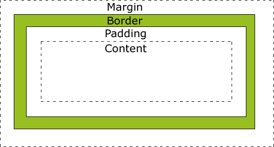
Each box can also have a border, margins and padding. This figure (from w3schools) helps to illustrate how the three are related:
(Source: w3schools)
The following properties can then be used to control the style of each box:
border-colorborder-widthborder-styleborder-top, border-right, border-bottom, border-leftpadding-top, padding-right, padding-bottom, padding-leftmargin-top, margin-right, margin-bottom, margin-leftIn the last module we saw the rudimentary border attribute of a table (e.g. <table border="1">), but with CSS we can control the style of a table.
In addition, each data element in a table (<td>) can be styled in any fashion.
In the next module we are going to see how web pages can be made more dynamic and interactive.
Some simple interactive behaviour can be achieved by just using CSS.
You may have seen that your web browser colours links that you have already visited differently than links that you have never visited before. You might have also seen websites that change the colour of a link when you hover over the link with your mouse or when you click (active-ate) a link.
CSS allows you to specify a different style for each different "interaction" with a hyperlink.
a:link    { color: #F2F; }
a:visited { color: #22F; }
a:active  { color: #2F2; }
a:hover   { color: #F22; font-size: 125%; font-weight: bold}
You can specify :hover behaviour for most HTML elements, not just links.
This can make your web page seem more interactive when you move your mouse around the page.
However, most touch-screens cannot detect when you hover, so this mode of interaction is becoming less popular.